Teman Belanja
Teman Belanja
Enhance the experience of buying wholesale goods
Enhance the experience of buying wholesale goods
Speciality
Product design
Release
October 2021
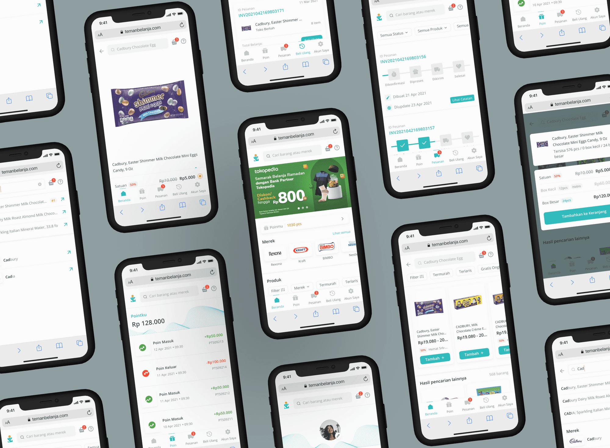

Teman Belanja Cover
Teman Belanja Cover
Teman Belanja is a web-based application developed by Procter & Gamble (P&G) to simplify wholesale purchases in Indonesia. The platform’s existing UI struggled to convey transaction details effectively, leading to user frustration and missed opportunities for engagement. My team and I took on the challenge of revamping the interface to improve usability and align it with the new branding.
Teman Belanja is a web-based application developed by Procter & Gamble (P&G) to simplify wholesale purchases in Indonesia. The platform’s existing UI struggled to convey transaction details effectively, leading to user frustration and missed opportunities for engagement. My team and I took on the challenge of revamping the interface to improve usability and align it with the new branding.
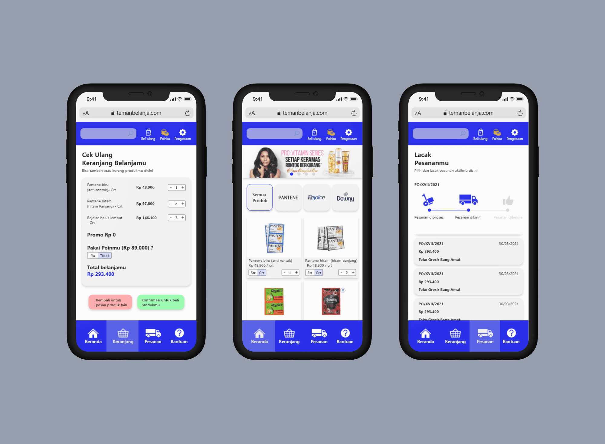

The UI needs to be improved
The UI needs to be improved
The Challenge
The Challenge
The primary challenge was improving the existing UI while addressing:
Missing or unclear transaction information.
Alignment between business requirements, user needs, and technological constraints.
Unifying disparate design styles created by multiple designers.
The primary challenge was improving the existing UI while addressing:
Missing or unclear transaction information.
Alignment between business requirements, user needs, and technological constraints.
Unifying disparate design styles created by multiple designers.
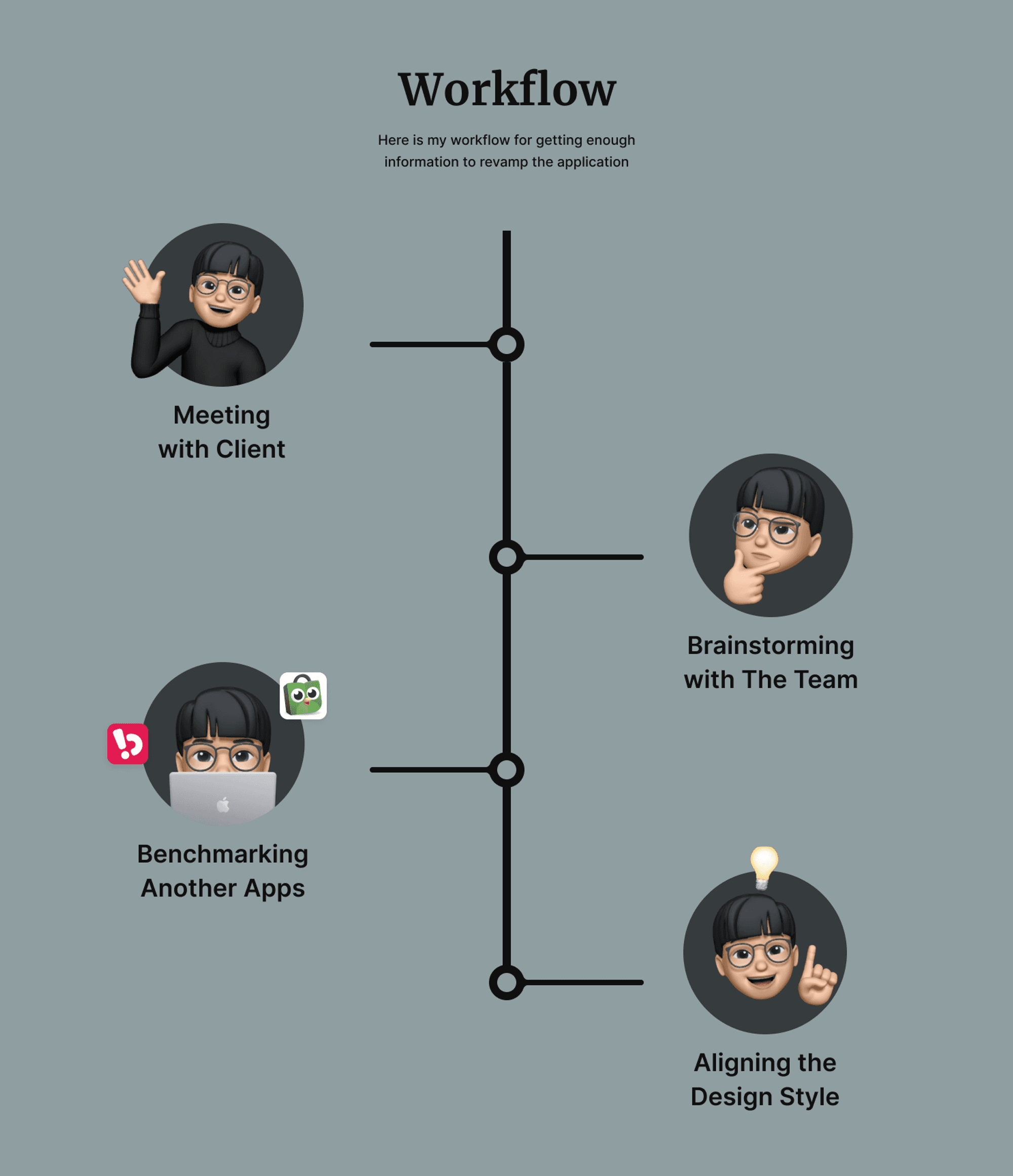

Design workflow
Design workflow
Approach
Approach
We followed a systematic approach to enhance the UI:
Client Alignment
Conducted discussions with the Project Manager and Developers to align on feasibility and project expectations.
Team Brainstorming
Analyzed business objectives and user needs to translate briefs into actionable UI designs.
Benchmarking & Competitive Analysis
Evaluated leading e-commerce platforms, including Tokopedia and Bukalapak, for design inspiration and best practices.
Design Style Refresh
Standardized the design style to reflect the new branding and ensure consistency across pages.

Getting to know the brief by calling the client via Zoom
Getting to know the brief by calling the client via Zoom
Understanding the Brief
Understanding the Brief
In a series of calls with the client, I clarified the project's scope and requirements:
Use the old design as a benchmark while incorporating new branding elements like logos, colors, and styles.
Design multiple key pages, including Login and Checkout, while covering various UI states for a seamless user journey.
Ensure the UI supports the end-to-end process effectively.
Aligning with Designers
Aligning with Designers
After gathering requirements, I collaborated with the design team to ensure a unified vision for the project. This involved:
Sharing the product brief and aligning on the expected outcome.
Setting the homepage design as the benchmark for maintaining consistency across all pages.
After gathering requirements, I collaborated with the design team to ensure a unified vision for the project. This involved:
Sharing the product brief and aligning on the expected outcome.
Setting the homepage design as the benchmark for maintaining consistency across all pages.
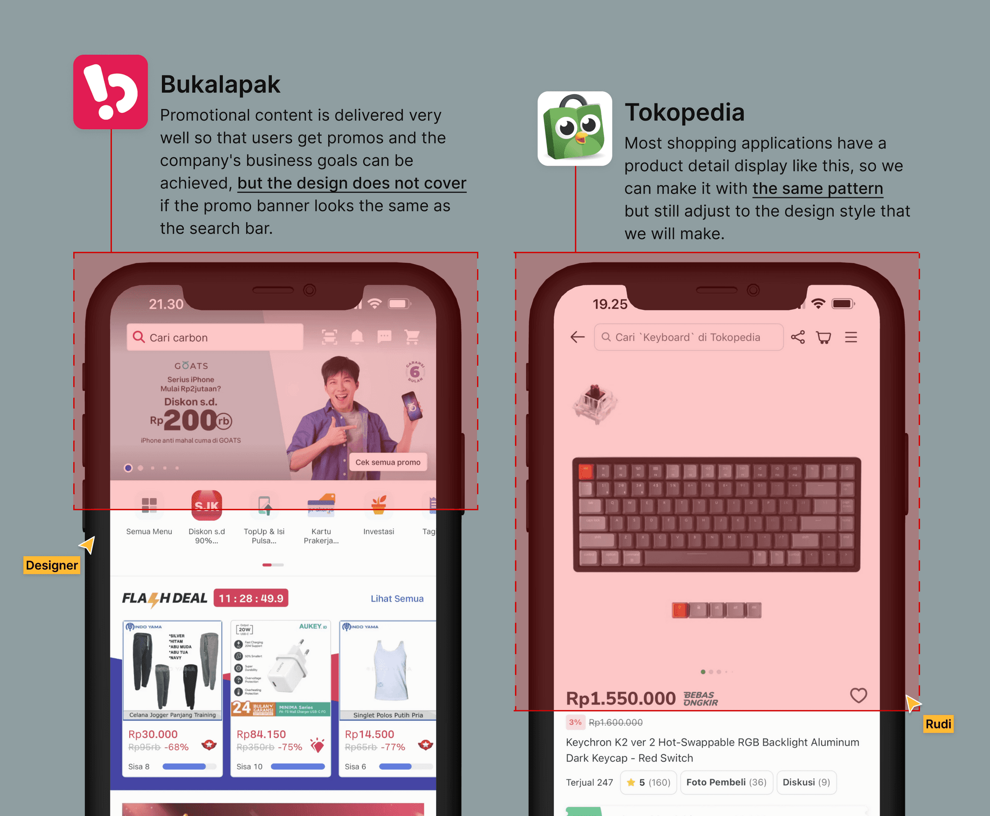

Benchmarking
Benchmarking
Benchmarking & Insights
Benchmarking & Insights
Our competitive analysis of platforms like Tokopedia and Bukalapak provided insights into:
Common UI patterns and navigation flows.
Areas where competitors excel and where we could differentiate.
Strategies to improve user engagement and reduce friction during transactions.
Our competitive analysis of platforms like Tokopedia and Bukalapak provided insights into:
Common UI patterns and navigation flows.
Areas where competitors excel and where we could differentiate.
Strategies to improve user engagement and reduce friction during transactions.
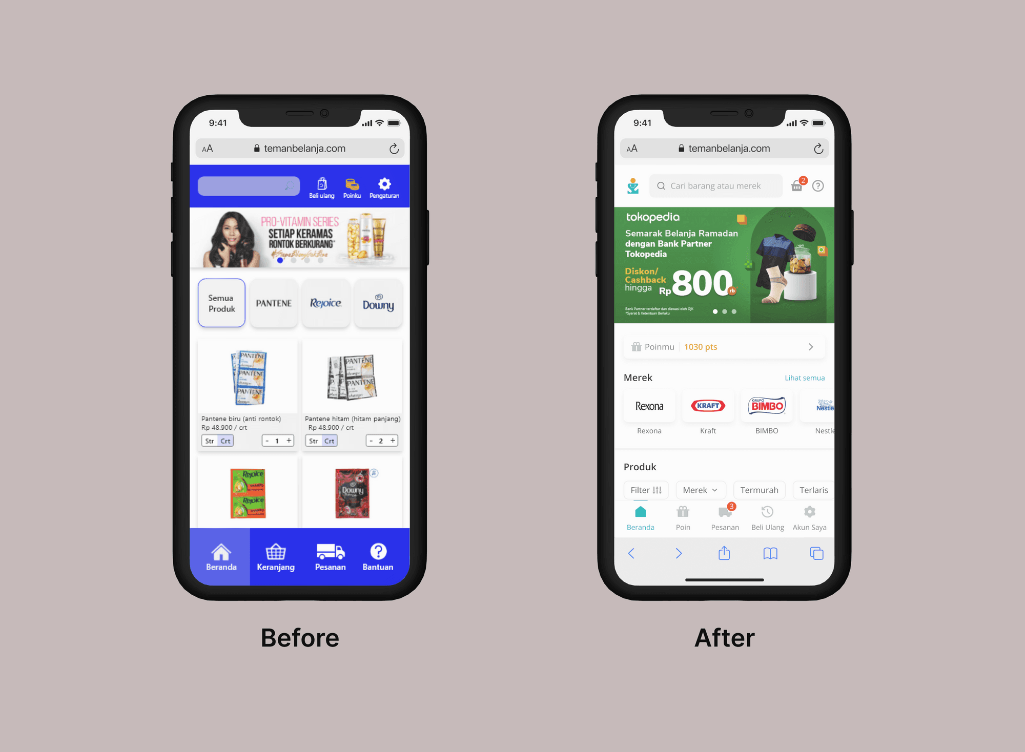

Before and after. The new look refreshes the design style by thinking about the best
approach to displaying Poin, Pesanan, and other features.
Before and after. The new look refreshes the design style by thinking about the best
approach to displaying Poin, Pesanan, and other features.
Refreshing the Design
Refreshing the Design
To create a cohesive and user-friendly design:
Branding Alignment: Incorporated the updated logo, colors, and styles provided by the client.
User-Centric Approach: Focused on intuitive layouts and navigation to minimize confusion.
Style Consistency: Standardized design elements across screens by starting with the homepage as the foundational template.